A Review of the Superfine! NYCX3 E-Fairs
by Sean Christopher Ward, Curator of HUE Gallery of Contemporary Art & Gallery Nocturnal
Chapter 1: (Wo)man E-Fair
I doubt I’m the first one to tell you, but the world is currently on lockdown! Weird? I know. Personally, I haven’t noticed much of a change, since I typically gravitate to anti-social tendencies, this social distancing has just peaked my interest in figuring out new ways to efficiently sell art, not only for myself, but also for my artist friends throughout the world. This is also why I love the Superfine! Art Fair model, because they, too, have been utilizing the digital world alongside their brick and mortar art fairs, since their inception. Rather than throw in the towel when the city tells you, mass group events are not allowed, they delayed their physical art fairs and focused their attention on e-fair models. Recently, they released the NYCX3 E-Fairs to the public and let me tell you first hand, it is not short on talent. Just from browsing the three e-fairs, I have found so many new artists I cannot wait to meet in person one day and see their art up close and personal. That’s where this review comes in. I want to take a moment to curate a selection of my favorite artworks in each of these fairs and tell you a little bit about why I chose each piece as one of my favorites. If you know me, you will understand that I go all in on everything I do. That being said, I am dividing this into a 3-part review. Otherwise, it would take me a week to write the entire article!
To begin, I will dive into (Wo)man: E-Fair, which is dedicated to the incredibly talent female artists throughout the world. This edition is not only an homage to women artists from all over the world, but it is another step forward towards equality in the arts, in a historically male dominant platform. (Wo)man does not focus on women as the centric focus of the artwork in this fair, but rather, as an open platform for what woman across the world are creating and it is truly astounding. Out of the three editions of the e-fair, this one is by far my favorite. I will stop rambling on and start showing you my top picks from this fair now, in no specific order.
--
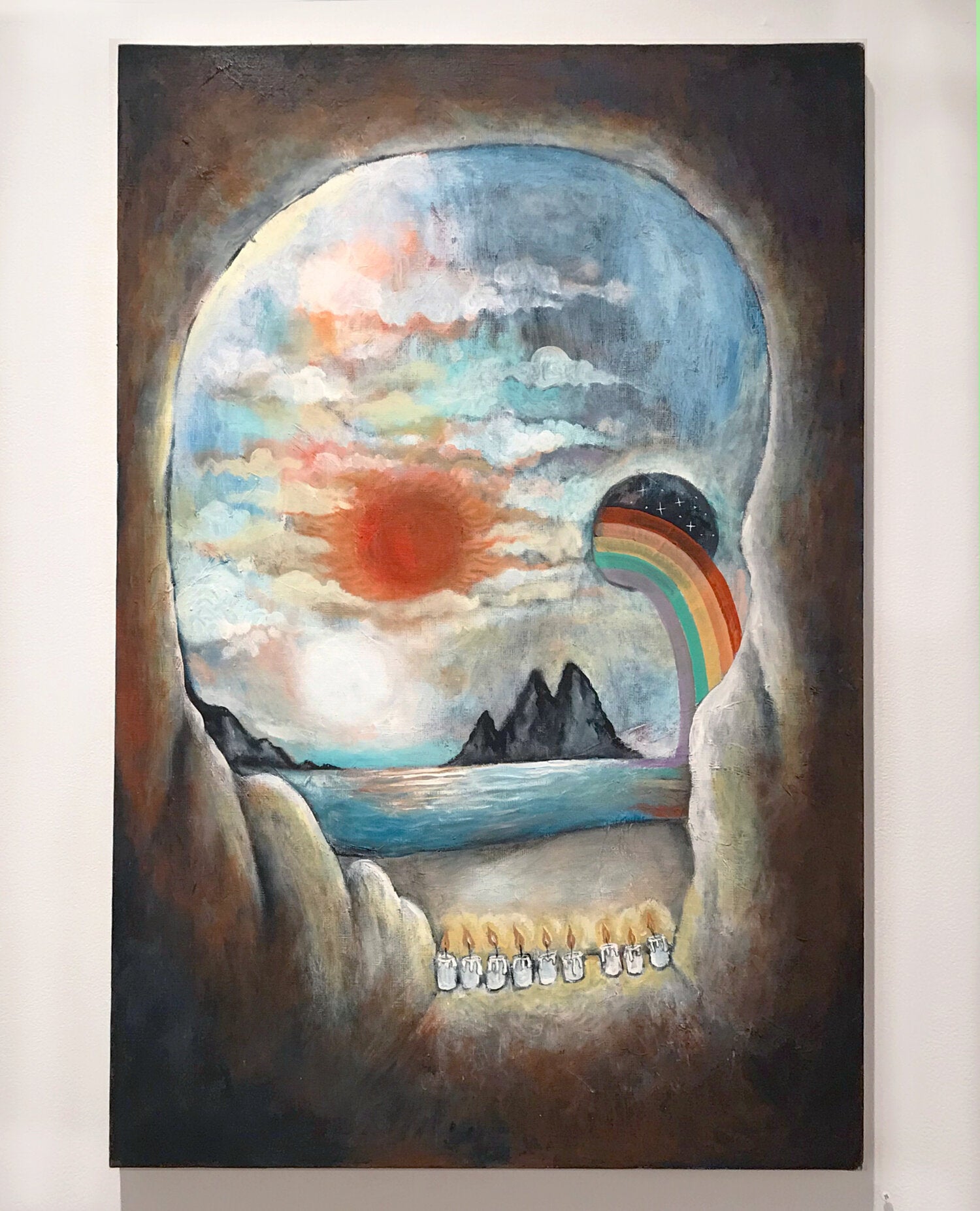
"Skull Cave" is a wonderful piece with so much to offer the viewer. It is not your ordinary painting and it reminds me of the nostalgia of cartoons through the 90's and 00's that focused on the painterly styles of illustration, while keeping hints of surrealism to entertain the mind. From the views of serenity of a beach, to the unknown nature of why one would need to keep a wall of candles to protect their home from the nature outside, this artwork maintains a level of playfulness and precision and would look amazing surrounded by dark decor.
--

"Still Standing" by Celine Gabrielle is a work that I kept coming back to examine further time and time again. It's a piece that is simple, yet incredibly intricate. The form of the subject is a pose you would see replicated many times in modeling, but the artist takes it so much further with the facial expression of the subject and the hand gestures, whilst the dominant color is that of a muted, but very happy, yellow. This is the reason I kept coming back to it. It's a juxtaposition of reasoning in my mind. You see someone who is dressed in an overly frilled outfit that looks as though it was tailored specifically for them, whilst the subject. has this expression of sadness, bordeom or uneasiness, as though it questions what is going on in the mind of this individual so bored in their current life of luxury. Yet, maybe it is not boredom? Maybe, their eyes are filled with excitement or maybe it's a call for help? WIthout speaking to the person, you may never know what is going on in their mind. This piece is a great example of what people are currently going through during social distancing, when everyone is ready to explore the world outside their own doors and wear that favorite dress of theirs, but they are stuck to celebrate life by themselves.
--
"Parachute Gal" is the epitomy of nostalgia for me. I grew up in the 90s and those little plastic army men you threw in the air with a parachute was one of my favorite things to do while I was young. We would go up as many stories as possible and throw the little guy off the buildings and see how long they could stay in the air. Now, with "Parachute Gal" it's as though these feelings of nostalgia are coming back, but with so much more detail and beauty. This artwork is what I imagine as the movement of feminism in society. To some, they see it as an invading force, but to others, it's the beauty of someone taking a risk and bringing their beliefs to unknown territories and hoping when they land, it will be welcomed with open arms. Truly a wonderful work of art.
--
"Grizzly Girls" is another work by Theresa Gooby. This artist has really impressed me. This specific work caught my eye instantly because of the contrast between these finely dressed characters and the scruffiness of the grizzly bear masks, or heads, of these characters. You have overwhelming joy on one side and anger on the other, like its a scale of emotions and its up to you to choose which side you agree with. No matter how you interpret this artwork, I have to commend these grizzlies on the wonderful choice of shoes.
--
Tina Psoinos' work is described as her perception on the " ephemeral, ever-changing nature of the street art scene, urban environment, and daily steps toward empowerment and equality" and this work speaks to that in a different way than what I am used to. Clothing that resembles someone trapped in a net, which could be a stance on societal hurdles, or that of a new fashion statement. Looking closer at the artwork, you might question the body of text in regards to its relevance as a whole, or the subcontext of individual words speaking louder than the whole, like this individual might do if you were to meet her walking down the street. Yet, could she see you, as she is blinded by the chaotic streaks of orange? It's a question that only you, the viewer, can decide.
--
"Honorifics" is an artwork that focuses on manipulating the composition, rather than telling a direct story. This work, in particular, grabbed my attention by the amount of texture she created through the usage of colors. It almost reminds me of caution tape hiding a scene behind it, not meant for the public eye... Yet, my curiosity will always make me want to see what is behind the tape. Is it chaos or is it the answer you have always been searching for? Examine the work with close detail and let me know what you see.
--
The artwork of Akane Ogura is amazing by itself, but upon reading the artist statement, I am intrigued more than ever about the artwork! "Unveiled" is a minimalistic work, that shows the beauty of the female, while also giving me this feeling that the subject is ethereal in a world made to match her beauty. What I question, though, is whether this person is real or a spirit, as described in Akane's artist statement? I'll leave it up to the viewers to decide.
--
"Lovers" is a work that speaks volumes with such a small amount of detail. When I first passed by the work, I thought it was maybe an optical illusion of the mirrored faces to see a vase in the middle, but then, when you look closer... You see all that is going on in the minds of each of these individuals... Are they petals counting down to a moment of intimacy, or are they swans that are a figure out beauty to so many people?
--

Take a close look at this piece. Really examine it. Upon first passing by this artwork, I saw it as a collage, while its composition is intriguing, it didn't catch my eye enough to write about it... That is... Until I looked at it very closely. At that point, it was a moment of eureka and I saw just how much depth went into creating this artwork and it amazes me every time I see it now! It is truly amazing how quickly browsing by a piece that is more detailed, it may not have a quick wow factor to you, but when you take time to see the beauty around you, then you will be rewarded with the glory of execution. This rogue figure in a forest of fauna and butterflies is a tale of camouflage and being one with the beauty of nature that surrounds you every day. The dot patterns in the background show an mixture of nature and the (wo)man-made working together as one. Without one, you may not have the other. With one, it might destroy the other. Yet, in this one moment in time, it shows just how well two things can work together as one. Bravo, Ashley.
--
Fiona, I like your style. Sharing a background in graphic design and translating that to the fine art world, I connect with her works almost immediately. Every part of the painting looks as though it is planned, yet, it is likely all done on a whim and its the training of being a designer that allow it to come out so incredibly crisp and clean. This piece spoke to me because of the connection i felt between this dark blue figure (or possibly, just a simple shape) and goal of obtaining that orb of ice cream goodness in it's sights. Without arms to reach out to grab this delicious treat, it is just glyphs used to translate the journey from point A to point B. Will this mysterious figure get its prize? Who will solve this mystery?
--
Ling Ju focuses on minimalism through most of her works, as you can see when you visit her whole body of work for this show, but this particular piece, "No. 18" is one that amazed me beyond belief! If I were walking out of a spaceship into an unknown world and saw this scene, I would want to sit down and stare at it for days. It looks so organic, yet, mystical, all at once. Then, with the monochromatic color palette going from mustard yellows to rust reds, it feels as though this place could exist, maybe even on our own planet? I have always had a fascination with the otherworldly, so I could ramble on forever. I'll move onto the next piece now.
--
Luz Rodriguez Dager's artwork has such a soft essence to it. The figure in the middle seems so innocent, yet exudes empowerment, then the brightly colored flora with dashes of contrast throughout each piece speak to me as an illustrative drawing, yet you can see how it is a watercolor and the execution and separation of each color palette is exquisite. This piece speaks deeply to me about the how so many of us blend in with our surrounding, not to outshine or hide behind, but simply to fit into our environment.
--
Another work by Tina Psoinos, but this once reminds me so much of one of my favorite American artists, Jasper Johns. Her work, however, stands on its own without that comparison. It plays directly with the human mind and implied design in the most minimalist form possible. As a graphic designer, I have to appreciate the time and effort it took to line this up perfectly, without sacrificing anything integrity in the saying itself. It's truly wonderful what the mind can come up with.
--
"Try Not To Choke Yourself" is a kaleidoscopic journey through a world unknown. Every aspect of this painting, from the silhouettes of human form, to the landscape and waterfall like shapes, give the mind so much to play with and through every turn, there is a new story to tell. The true vastness of this work cannot be constrained within a computer screen, it truly needs to be seen in person to appreciate every detail of the painting. What do you see when you stare at it? I see the struggles of humankind to sublimate manmade beauty onto nature itself. With every decision, came another decision to cover, or replace, the works below it.
--
The final artwork of this review, "Creation in the Sky" by Yuko Uchida plays homage to so many styles of woodblock printing dating back to the Edo period of Japan, yet, she goes further with more gestural and uncontrolled strokes, that make this like a mixture of classical techniques and modern day graffiti art. Through every combination of strokes, I see more and more potential stories to make within my own mind. A great piece to finish off this review of Superfine! Art Fair (wo)man E-fair.
Now that you've seen my top picks, I suggest you do the same and go to (Wo)man E-Fair and see what pieces are your favorites! Feel free to share your list with me, my contact information is below. I hope you enjoyed my interpretations from this e-fair and I plan to release my thoughts on the next chapter,
Myth e-fair, in the coming days.
Cheers,